Optics brand photo of girl smiling with sunglasses

Vision is more than 20/20

Vision is more than 20/20

Vision is more than 20/20

Vision is more than 20/20

Vision is more than 20/20

Client

Optics Optometry

project

Branding

Credits

Photos by Daniel Lincoln and
Joanna Nix-Walkup

Overview

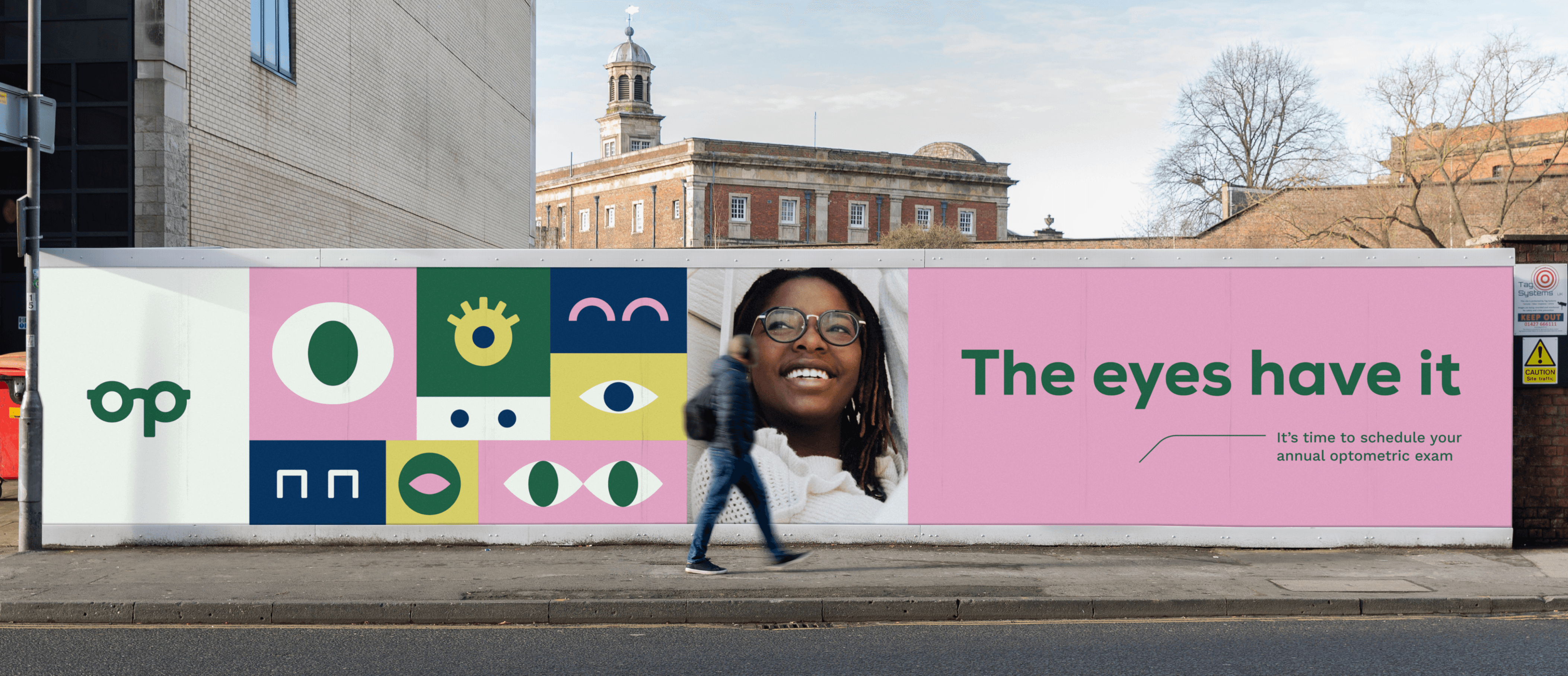
Optometrists are often only considered when vision is blurry, but annual exams provide much more than that. Diabetes, cancer, heart disease, and many other diagnoses can be caught early just by looking at the retina and nerves. Optics aims to reframe the culture around eye health, while elevating their mom-and-pop shop to a trendy stop for lensware.

Considerations

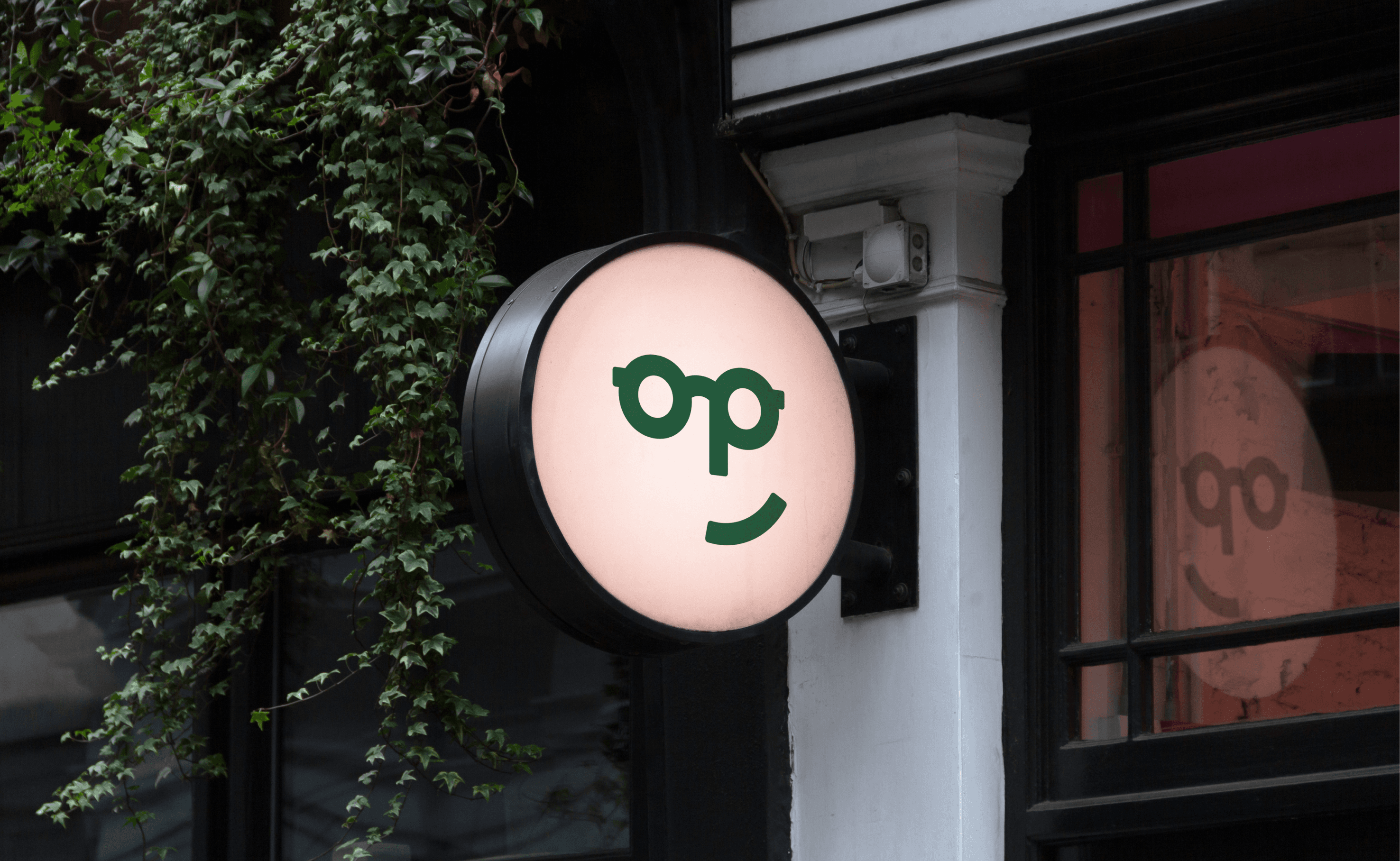
Drawn within the wordmark is a pair of glasses and hint at a nose, denoting an immediate connection to the industry.

Bright colors, quirky illustrations, and cheeky copy help to communicate a fresh and spirited personality.

A keyline, used as a visual device, resembles the shape of a frame’s ear.

Billboard of illustrated eyes
Optic's logo green on green
Pink sticker with an illustrated eye on it
Outdoor signage
Outdoor signage
Outdoor signage
Outdoor signage

Browse more projects

Envoy Project
Envoy Project
Envoy Project
Envoy Project
Envoy Project
ReadMe project

© 2023 Amy Design LLC

© 2023 Amy Design LLC

© 2023 Amy Design LLC

© 2023 Amy Design LLC